
Thanks to J. Paul Hawthorne, author of the GeneaSpy blog, many of us out here in the genealogy-blogging world spent some time this last week creating these fun birthplace pedigree charts.
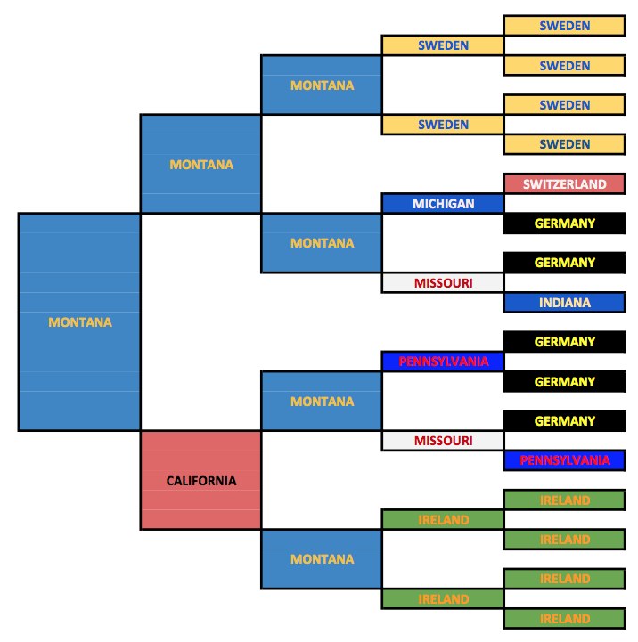
As a brief explanation, the first cell represents my birthplace, the next two are my father and mother, then their parents, and so on. I used colors that “sorta” reflect the flags of the particular states and countries. And it was interesting to have a visual showing just how much German ancestry I have on both sides of my family. It certainly explains my DNA results – 54% Europe West!
And then I thought it would be fun to do another chart that shows the birthplaces by continent only (blue = North America and yellow = Europe). So I created this one.
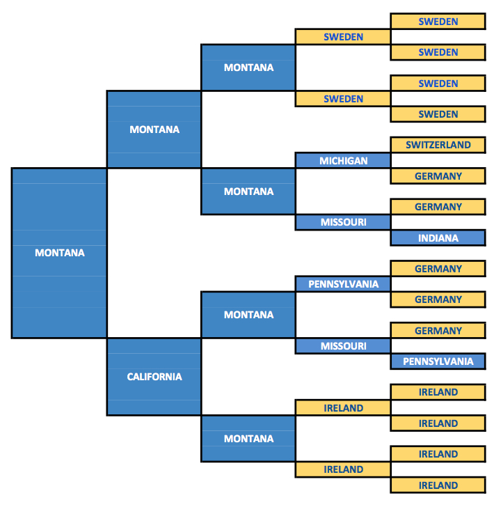
This chart is interesting because it reminds me – and should remind most all of us – that we are immigrants. And in my case, fairly recent – except for my great great grandmother (in the 5th generation) who was born in Pennsylvania in 1829. Her line dates back to my 8th great grandfather who ended up in Rhode Island in about 1638. But even he was an immigrant from England.
Thanks Paul for the fun BSO!1
Copyright (c) 2016, Lark M. Dalin Robart
- “Bright Shiny Object” ↩
